Illustrated Vector Map
- Kartik Richharia
- Sep 9, 2021
- 3 min read

Updated: Nov 20, 2021
This Area is the usual hangout place for me and my friends. After a long day, nothing is better than a plate of momos and a glass of cold coffee. I look forward to coming here every evening to chat with all of my close friends.

This area is fairly far from my place, but this doesn't stop my friends and me to come here. the coffee shop has become our everyday hangout spot and it is the best cold coffee money could buy. This is my chill zone and I will definitely miss this spot when I come to Delhi.

I originally made the map when I got the COVID shot, so the hand-drawn map doesn't look that good. But still, I made the line drawing for it with the pen tool and continued with the map.

I wasn't happy with the original layout of the map, so I remade the layout of the map by making the lines fatter and bolder, so it utilizes the space a bit better.
ICONS

I also used the Pen tool for creating these Icons. I took images from the internet and traced them with the help of the pen tool to create these icons.

I first downloaded this image from the internet of 3 people sitting on an Activa, which is something Me and my friends used to do every day when going to this place, so I wanted to create the icon of my friends and me tripling.
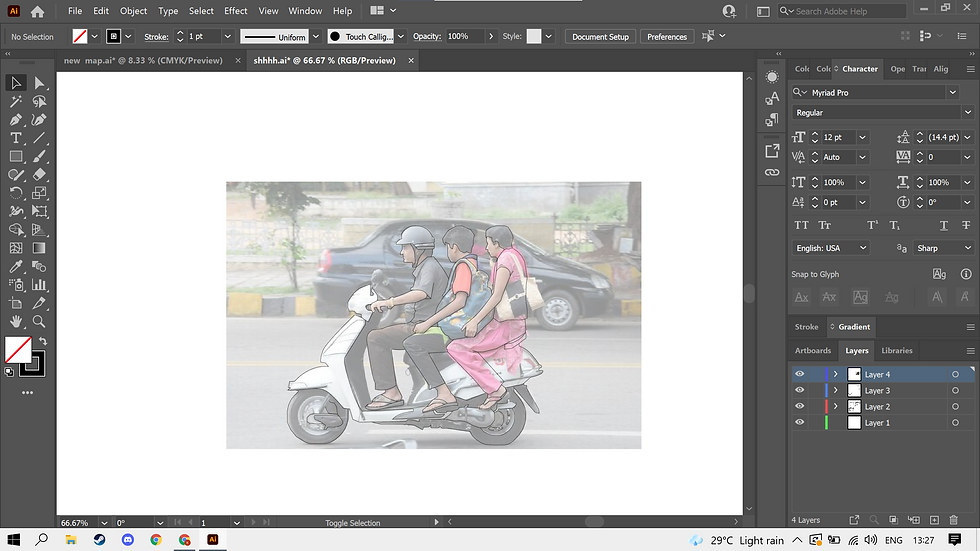
When creating the outline for the Icon, I lowered down the opacity of the image and started tracing the image with the pen tool. I also changed the gender of the last person because the friends I used to go out with were both guys.

This is final outcome of the Icon
COLOR PALLET

This is the color pallet for my map. I used these colors because I wanted to depict night-time scene, hence why I used darker shades of colors.

Also, instead of using black or white, I used dark navy blue and Cream to make the color pallet less boring to look at.

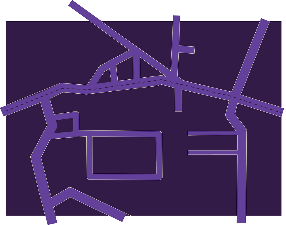

Then I added Icons to all of the locations that I go to. I used this reddish-purple for that icon because it was very contrasty to the colors that I've used on the map. I also added a thin off-white lining to the road to make the roads pop.
COLORING ICONS


PUTTING IT ALL TOGETHER

EXPLORING WITH TEXTURES

I applied a sponge texture to the
background and applied smudge stick to the icons

FINAL OUTCOME

I wanted to create a minimalist-looking map from the get-go, hence why I didn't add many icons to my map. This is why I removed a lot of the trees from my original map design. The final outcome of the map is a minimalist-looking map that I originally planned to do from the beginning.
CONCLUSION
successes
I like the color pallet that I used. I feel that it matches the overall vibe of the area that I made.
I think that the icons that I made came out really well they suit the minimalist look that I wanted.
I like the textures that I added to the background, it some how makes the map look more filled than it actually is.
scope of improvement
I could've created a better looking layout for my map, because I think my map looks a bit empty.
I could've played a lot more with the textures to create more depth to the map.
I could've added more text to the map to explain the map properly.
Final Changes


Comments